In 2015, the Wall Street Journal (WSJ) published a highly effective series of heatmaps illustrating the impact of vaccines on infectious diseases in the United States. These visualizations showcased the power of blanket policies to drive widespread change. You can view the heatmaps here.
Heatmaps are a versatile tool for data analysis. Their ability to facilitate comparative analysis, highlight temporal trends, and enable pattern recognition makes them invaluable for communicating complex information.
In this Quick Success Data Science project, we’ll use Python’s Matplotlib graphing library to recreate the WSJ’s measles chart, demonstrating how to leverage heatmaps and carefully designed colorbars to influence data storytelling.
The data
The disease data comes from the University of Pittsburgh’s Project Tycho. This organization works with national and global health institutes and researchers to make data easier to use to improve global health. The measles data is available under a Creative Commons Attribution 4.0 International Public License.
For convenience, I’ve downloaded the data from Project Tycho’s data portal to a CSV file and stored it in this Gist. Later, we’ll access it programmatically through the code.
The measles heatmap
We’ll use the Matplotlib pcolormesh() function to construct a close facsimile of the WSJ measles heatmap. While other libraries, such as Seaborn, Plotly Express, and hvplot, include dedicated heatmap functions, these are built for ease of use, with most of the design decisions abstracted away. This makes it difficult to force their results to match the WSJ heatmap.
Besides pcolormesh(), Matplotlib’s imshow() function (for “image show”) can also produce heatmaps. The pcolormesh function, however, better aligns gridlines with cell edges.
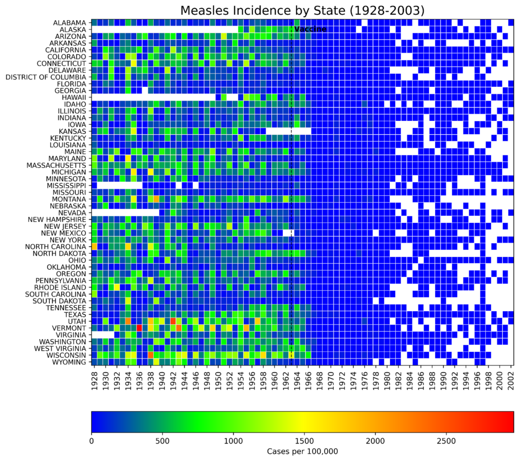
Here’s an example of a heatmap made with imshow() that you compare to the pcolormesh() results later. The main difference is the lack of gridlines.
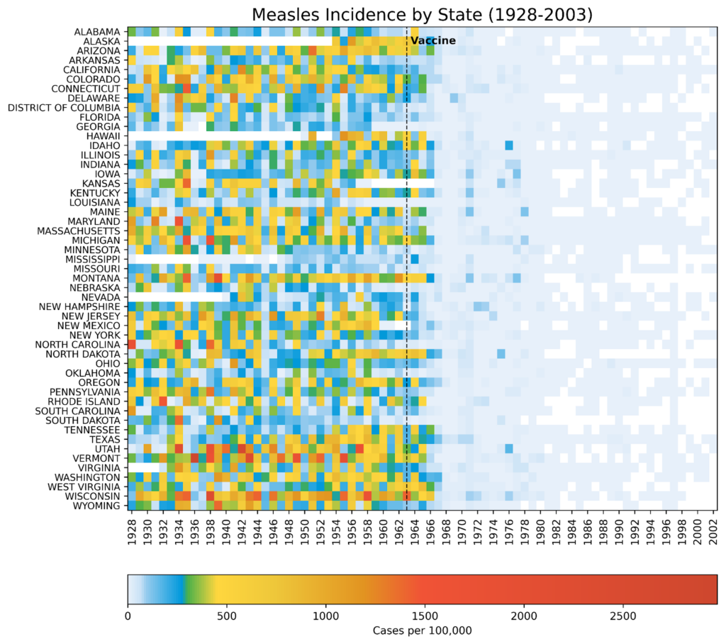
imshow()function (by the author)In 1963, the measles vaccine was licensed and released across America with widespread uptake. Within five years, the incidence of the disease was greatly reduced. By 2000, measles had been considered eradicated in the United States, with any new cases arriving from outside the country. Notice how well the visualization conveys this “big picture” while preserving the state-level details. This is due in no small part to the choice of colorbar.
The colors used in the visualization are biased. More than 80% of the colorbar is composed of warm colors, and (light) blue is reserved for the smallest values. This makes it easy to demarcate the pre- and post-vaccination periods. White cells denote missing data, represented by NaN (Not a Number) values.
Compare the previous heatmap to one built with a more balanced colorbar:
The darker blue color not only overpowers the plot, it’s hard on the eyes. And while it’s still possible to see the effect of the vaccine, the visual impact is far more subtle than in the plot with the biased colorbar. Alternately, it’s easier to parse higher values but at the expense of the overall theme.
The code
The following code was written in JupyterLab and is presented by cell.
Importing libraries
The first cell imports the libraries we’ll need to complete the project. An online search for the library names will lead you to the installation instructions.
import numpy as np
import matplotlib.pyplot as plt
from matplotlib.colors import LinearSegmentedColormap, Normalize
from matplotlib.cm import ScalarMappable
import pandas as pd
Creating the custom colormap
The following code closely reproduces the colormap used by the WSJ. I used the online Image Color Picker tool to identify the key colors from a screenshot of their measles heatmap and adjusted these based on colors chosen for a similar tutorial built for R.
# Normalize RGB colors:
colors = ['#e7f0fa',  # lightest blue
          '#c9e2f6',  # light blue
          '#95cbee',  # blue
          '#0099dc',  # dark blue
          '#4ab04a',  # green
          '#ffd73e',  # yellow
          '#eec73a',  # yellow brown
          '#e29421',  # dark tan
          '#f05336',  # orange
          '#ce472e']  # red

# Create a list of positions for each color in the colormap:
positions = [0, 0.02, 0.03, 0.09, 0.1, 0.15, 0.25, 0.4, 0.5, 1]

# Create a LinearSegmentedColormap (continuous colors):
custom_cmap = LinearSegmentedColormap.from_list('custom_colormap',
                                                list(zip(positions,
                                                         colors)))

# Display a colorbar with the custom colormap:
fig, ax = plt.subplots(figsize=(6, 1))

plt.imshow([list(range(256))],
           cmap=custom_cmap,
           aspect='auto',
           vmin=0, vmax=255)

plt.xticks([]), plt.yticks([])
plt.show()
Here’s the generic colorbar produced by the code:

This code makes a continuous colormap using Matplotlib’s LinearSegmentedColormap() class. This class specifies colormaps using anchor points between which RGB(A) values are interpolated. That is, it generates colormap objects based on lookup tables using linear segments. It creates the lookup table using linear interpolation for each primary color, with the 0–1 domain divided into any number of segments. For more details, see this short tutorial on making custom colormaps with Matplotlib.
Loading and prepping the disease data
Next, we load the CSV file into pandas and prep it for plotting. This file contains the incidence of measles (as the number of cases per 100,000 people) for each state (and the District of Columbia) by week from 1928 to 2003. We’ll need to convert the values to a numeric data type, aggregate the data by year, and reshape the DataFrame for plotting.
# Read the csv file into a DataFrame:
url = 'https://bit.ly/3F47ejX'
df_raw = pd.read_csv(url)

# Convert to numeric and aggregate by year:
df_raw.iloc[:, 2:] = (df_raw.iloc[:, 2:]
                      .apply(pd.to_numeric,
                             errors='coerce'))

df = (df_raw.groupby('YEAR', as_index=False)
        .sum(min_count=1, numeric_only=True)
        .drop(columns=['WEEK']))

# Reshape the data for plotting:
df_melted = df.melt(id_vars='YEAR',
                    var_name='State',
                    value_name='Incidence')

df_pivot = df_melted.pivot_table(index='State',
                                 columns='YEAR',
                                 values='Incidence')

# Reverse the state order for plotting:
df_pivot = df_pivot[::-1]
Here’s how the initial (raw) DataFrame looks, showing the first five rows and ten columns:
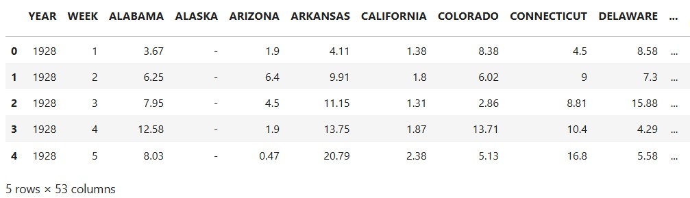
df_raw DataFrame (by author)NaN values are represented by a dash (-).
The final df_pivot DataFrame is in wide format, where each column represents a variable, and rows represent unique entities:
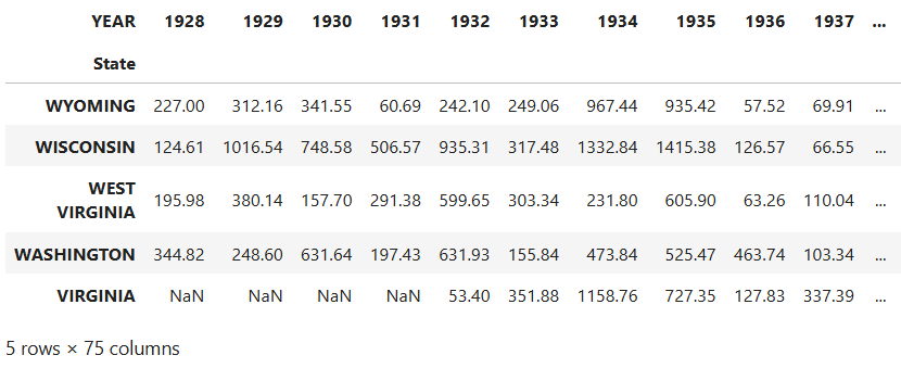
dv_pivot DataFrame (by author)While plotting is generally performed using long format data, as in the df_raw DataFrame, pcolormesh() prefers wide format when making heatmaps. This is because heatmaps are inherently designed to display a 2D matrix-like structure, where rows and columns represent distinct categories. In this case, the final plot will look much like the DataFrame, with states along the y-axis and years along the x-axis. Each cell of the heatmap will be colored based on the numerical values.
Handling missing values
The dataset contains a lot of missing values. We’ll want to distinguish these from 0 values in the heatmap by making a mask to identify and store these NaN values. Before applying this mask with NumPy, we’ll use Matplotlib’s Normalize() class to normalize the data. This way, we can directly compare the heatmap colors across states.
# Create a mask for NaN values:
nan_mask = df_pivot.isna()

# Normalize the data for a shared colormap:
norm = Normalize(df_pivot.min().min(), df_pivot.max().max())

# Apply normalization before masking:
normalized_data = norm(df_pivot)

# Create masked array from normalized data:
masked_data = np.ma.masked_array(normalized_data, mask=nan_mask)
Plotting the heatmap
The following code creates the heatmap. The heart of it consists of the single line calling the pcolormesh() function. Most of the rest embellishes the plot so that it looks like the WSJ heatmap (with the exception of the x, y, and colorbar labels, which are greatly improved in our version).
# Plot the data using pcolormesh with a masked array:
multiplier = 0.22  # Changes figure aspect ratio
fig, ax = plt.subplots(figsize=(11, len(df_pivot.index) * multiplier))

states = df_pivot.index
years = df_pivot.columns

im = plt.pcolormesh(masked_data, cmap=custom_cmap,
                    edgecolors='w', linewidth=0.5)

ax.set_title('Measles Incidence by State (1928-2002)', fontsize=16)

# Adjust x-axis ticks and labels to be centered:
every_other_year_indices = np.arange(0, len(years), 2) + 0.5
ax.set_xticks(every_other_year_indices)
ax.set_xticklabels(years[::2], rotation='vertical', fontsize=10)

# Adjust labels on y-axis:
ax.set_yticks(np.arange(len(states)) + 0.5)  # Center ticks in cells
ax.set_yticklabels(states, fontsize=9)

# Add vertical line and label for vaccine date:
vaccine_year_index = list(years).index(1963)
ax.axvline(x=vaccine_year_index, linestyle='--',
           linewidth=1, color='k')
alaska_index = states.get_loc('ALASKA')
ax.text(vaccine_year_index, alaska_index, ' Vaccine',
        ha='left', va='center', fontweight='bold')

# Add a colorbar:
cbar = fig.colorbar(ScalarMappable(norm=norm, cmap=custom_cmap),
                    ax=ax, orientation='horizontal', pad=0.1,
                    label='Cases per 100,000')
cbar.ax.xaxis.set_ticks_position('bottom')

plt.savefig('measles_pcolormesh_nan.png', dpi=600, bbox_inches='tight')
plt.show()
Here’s the result:
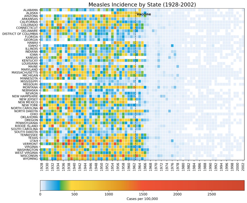
pcolormesh() function (by the author)This is a close approximation of the WSJ heatmap, with what I consider more legible labels and better separation of 0 and NaN (missing data) values.
Uses for heatmaps
Heatmaps are highly effective at demonstrating how a blanket policy or action impacts multiple geographic regions over time. Thanks to their versatility, they can be adapted for other purposes, such as tracking:
- Air quality index levels in different cities before and after the Clean Air Act
- Change in test scores for schools or districts after policies like No Child Left Behind
- Unemployment rates for different regions after economic stimulus packages
- Product sales performance by region after local or nationwide ad campaigns
Among the advantages of heatmaps is that they promote multiple analysis techniques. These include:
Comparative Analysis: easily compare trends across different categories ( states, schools, regions, etc.).
Temporal Trends: elegantly show how values change over time.
Pattern Recognition: identify patterns and anomalies in the data at a glance.
Communication: Provide a clear and concise way to communicate complex data.
Heatmaps are a great way to present a big-picture overview while preserving the data’s fine-scale granularity.