Want smarter insights in your inbox? Sign up for our weekly newsletters to get only what matters to enterprise AI, data, and security leaders. Subscribe Now
The promise sounds almost too good to be true: drop a messy comma separated values (CSV) file into an AI agent, wait two minutes, and get back a polished, interactive chart ready for your next board presentation.
But that’s exactly what Chinese startup Manus.im is delivering with its latest data visualization feature, launched this month.
Unfortunately, my initial hands-on testing with corrupted datasets reveals a fundamental enterprise problem: impressive capabilities paired with insufficient transparency about data transformations. While Manus handles messy data better than ChatGPT, neither tool is yet ready for boardroom-ready slides.
Rossums’ survey of 470 finance leaders found 58% still rely primarily on Excel for monthly KPIs, despite owning BI licenses. Another TechRadar study estimates that overall spreadsheet dependence affects roughly 90% of organizations — creating a “last-mile data problem” between governed warehouses and hasty CSV exports that land in analysts’ inboxes hours before critical meetings.
The AI Impact Series Returns to San Francisco – August 5
The next phase of AI is here – are you ready? Join leaders from Block, GSK, and SAP for an exclusive look at how autonomous agents are reshaping enterprise workflows – from real-time decision-making to end-to-end automation.
Secure your spot now – space is limited: https://bit.ly/3GuuPLF
Manus targets this exact gap. Upload your CSV, describe what you want in natural language, and the agent automatically cleans the data, selects the appropriate Vega-Lite grammar and returns a PNG chart ready for export—no pivot tables required.
Where Manus beats ChatGPT: 4x slower but more accurate with messy data
I tested both Manus and ChatGPT’s Advanced Data Analysis using three datasets (113k-row ecommerce orders, 200k-row marketing funnel 10k-row SaaS MRR), first clean, then corrupted with 5% error injection including nulls, mixed-format dates and duplicates.
For example, testing the same prompt — "Show me a month-by-month revenue trend for the past year and highlight any unusual spikes or dips" — across clean and corrupted 113k-row e-commerce data revealed some stark differences.| Tool | Data Quality | Time | Cleans Nulls | Parses Dates | Handles Duplicates | Comments |
| Manus | Clean | 1:46 | N/A | ✓ | N/A | Correct trend, standard presentation, but incorrect numbers |
| Manus | Messy | 3:53 | ✓ | ✓ | ✗ | Correct trend despite inaccurate data |
| ChatGPT | Clean | 0:57 | N/A | ✓ | N/A | Fast, but incorrect visualisation |
| ChatGPT | Messy | 0:59 | ✗ | ✗ | ✗ | Incorrect trend from unclean data |
For context: DeepSeek could only handle 1% of the file size, while Claude and Grok took over 5 minutes each but produced interactive charts without PNG export options.
Outputs:
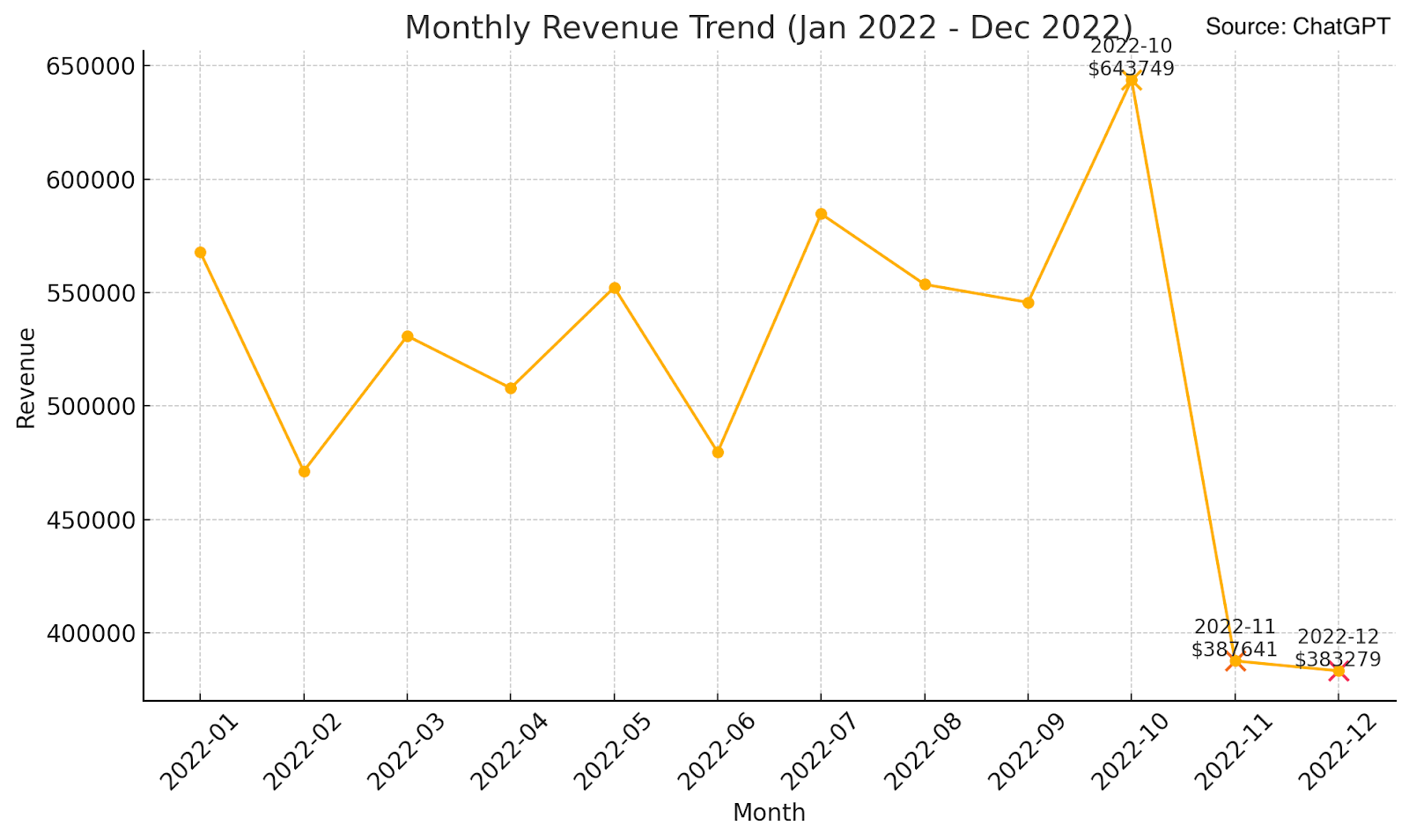
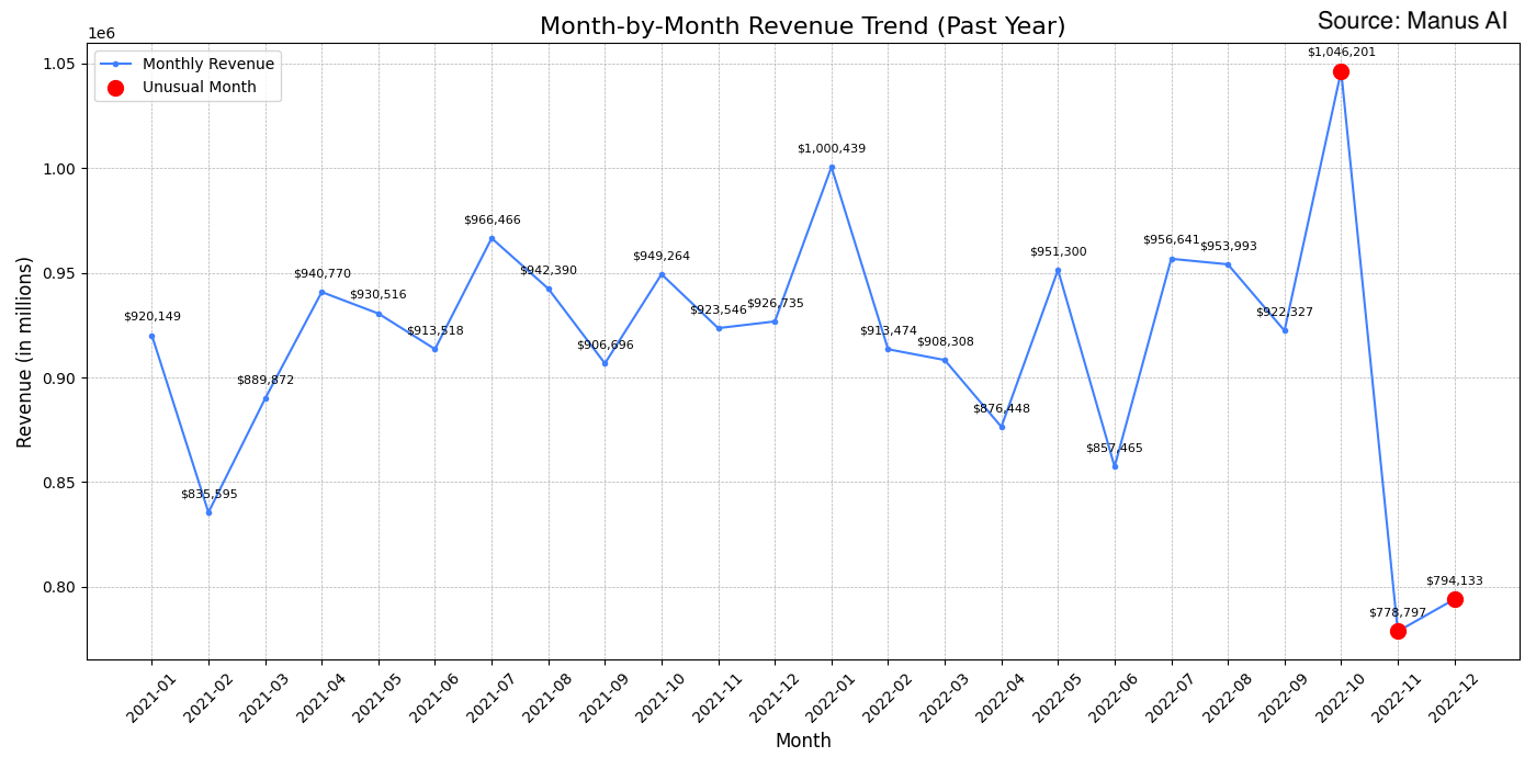
Figure 1-2: Chart outputs from the same revenue trend prompt on messy e-commerce data. Manus (bottom) produces a coherent trend despite data corruption, while ChatGPT (top) shows distorted patterns from unclean date formatting.
Manus behaves like a cautious junior analyst — automatically tidying data before charting, successfully parsing date inconsistencies and handling nulls without explicit instructions. When I requested the same revenue trend analysis on corrupted data, Manus took nearly 4 minutes but produced a coherent visualization despite the data quality issues.
ChatGPT operates like a speed coder — prioritizing fast output over data hygiene. The same request took just 59 seconds but produced misleading visualizations because it didn’t automatically clean formatting inconsistencies.
However, both tools failed in terms of “executive readiness.” Neither produced board-ready axis scaling or readable labels without follow-up prompts. Data labels were frequently overlapping or too small, bar charts lacked proper gridlines and number formatting was inconsistent.
The transparency crisis enterprises can’t ignore
Here’s where Manus becomes problematic for enterprise adoption: the agent never surfaces cleaning steps it applies. An auditor reviewing the final chart has no way to confirm whether outliers were dropped, imputed or transformed.
When a CFO presents quarterly results based on a Manus-generated chart, what happens when someone asks, “How did you handle the duplicate transactions from the Q2 system integration?” The answer is silence.
ChatGPT, Claude and Grok all show their Python code, though transparency through code review isn’t scalable for business users lacking programming experience. What enterprises need is a simpler audit trail, which builds trust.
Warehouse-native AI is racing ahead
While Manus focuses on CSV uploads, major platforms are building chart generation directly into enterprise data infrastructure:
Google’s Gemini in BigQuery became generally available in August 2024, enabling the generation of SQL queries and inline visualizations on live tables while respecting row-level security.
Microsoft’s Copilot in Fabric reached GA in the Power BI experience in May 2024, creating visuals inside Fabric notebooks while working directly with Lakehouse datasets.
GoodData’s AI Assistant, launched in June 2025, operates within customer environments and respects existing semantic models, allowing users to ask questions in plain language while receiving answers that align with predefined metrics and business terms.
These warehouse-native solutions eliminate CSV exports entirely, preserve complete data lineage and leverage existing security models — advantages file-upload tools like Manus struggle to match.
Critical gaps for enterprise adoption
My testing revealed several blockers:
Live data connectivity remains absent — Manus supports file uploads only, with no Snowflake, BigQuery or S3 connectors. Manus.im says connectors are “on the roadmap” but offers no timeline.
Audit trail transparency is completely missing. Enterprise data teams need transformation logs showing exactly how AI cleaned their data and whether its interpretation of the fields are correct.
Export flexibility is limited to PNG outputs. While adequate for quick slide decks, enterprises need customizable, interactive export options.
The verdict: impressive tech, premature for enterprise use cases
For SMB executives drowning in ad-hoc CSV analysis, Manus’s drag-and-drop visualisation seems to be doing the job.
The autonomous data cleaning handles real-world messiness that would otherwise require manual preprocessing, cutting turnaround from hours to minutes when you have reasonably complete data.
Additionally, it offers a significant runtime advantage over Excel or Google Sheets, which require manual pivots and incur substantial load times due to local compute power limitations.
But regulated enterprises with governed data lakes should wait for warehouse-native agents like Gemini or Fabric Copilot, which keep data inside security perimeters and maintain complete lineage tracking.
Bottom line: Manus proves one-prompt charting works and handles messy data impressively. But for enterprises, the question isn’t whether the charts look good — it’s whether you can stake your career on data transformations you can’t audit or verify. Until AI agents can plug directly into governed tables with rigorous audit trails, Excel will continue to hold its starring role in quarterly presentations.