In this third part of my series, I will explore the evaluation process which is a critical piece that will lead to a cleaner data set and elevate your model performance. We will see the difference between evaluation of a trained model (one not yet in production), and evaluation of a deployed model (one making real-world predictions).
In Part 1, I discussed the process of labelling your image data that you use in your Image Classification project. I showed how to define “good” images and create sub-classes. In Part 2, I went over various data sets, beyond the usual train-validation-test sets, such as benchmark sets, plus how to handle synthetic data and duplicate images.
Evaluation of the trained model
As machine learning engineers we look at accuracy, F1, log loss, and other metrics to decide if a model is ready to move to production. These are all important measures, but from my experience, these scores can be deceiving especially as the number of classes grows.
Although it can be time consuming, I find it very important to manually review the images that the model gets wrong, as well as the images that the model gives a low softmax “confidence” score to. This means adding a step immediately after your training run completes to calculate scores for all images — training, validation, test, and the benchmark sets. You only need to bring up for manual review the ones that the model had problems with. This should only be a small percentage of the total number of images. See the Double-check process below
What you do during the manual evaluation is to put yourself in a “training mindset” to ensure that the labelling standards are being followed that you setup in Part 1. Ask yourself:
- “Is this a good image?” Is the subject front and center, and can you clearly see all the features?
- “Is this the correct label?” Don’t be surprised if you find wrong labels.
You can either remove the bad images or fix the labels if they are wrong. Otherwise you can keep them in the data set and force the model to do better next time. Other questions I ask are:
- “Why did the model get this wrong?”
- “Why did this image get a low score?”
- “What is it about the image that caused confusion?”
Sometimes the answer has nothing to do with that specific image. Frequently, it has to do with the other images, either in the ground truth class or in the predicted class. It is worth the effort to Double-check all images in both sets if you see a consistently bad guess. Again, don’t be surprised if you find poor images or wrong labels.
Weighted evaluation
When doing the evaluation of the trained model (above), we apply a lot of subjective analysis — “Why did the model get this wrong?” and “Is this a good image?” From these, you may only get a gut feeling.
Frequently, I will decide to hold off moving a model forward to production based on that gut feel. But how can you justify to your manager that you want to hit the brakes? This is where putting a more objective analysis comes in by creating a weighted average of the softmax “confidence” scores.
In order to apply a weighted evaluation, we need to identify sets of classes that deserve adjustments to the score. Here is where I create a list of “commonly confused” classes.
Commonly confused classes
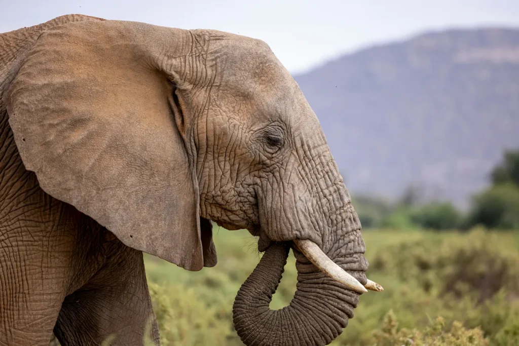
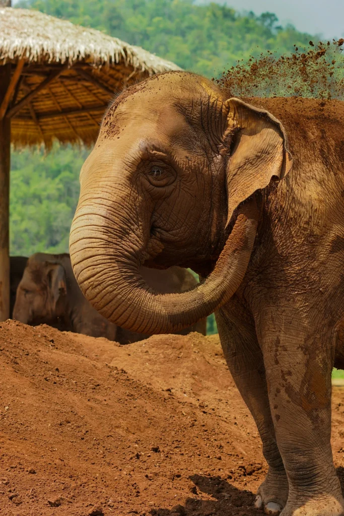
Certain animals at our zoo can easily be mistaken. For example, African elephants and Asian elephants have different ear shapes. If your model gets these two mixed up, that is not as bad as guessing a giraffe! So perhaps you give partial credit here. You and your subject matter experts (SMEs) can come up with a list of these pairs and a weighted adjustment for each.
This weight can be factored into a modified cross-entropy loss function in the equation below. The back half of this equation will reduce the impact of being wrong for specific pairs of ground truth and prediction by using the “weight” function as a lookup. By default, the weighted adjustment would be 1 for all pairings, and the commonly confused classes would get something like 0.5.
In other words, it’s better to be unsure (have a lower confidence score) when you are wrong, compared to being super confident and wrong.

Once this weighted log loss is calculated, I can compare to previous training runs to see if the new model is ready for production.
Confidence threshold report
Another valuable measure that incorporates the confidence threshold (in my example, 95) is to report on accuracy and false positive rates. Recall that when we apply the confidence threshold before presenting results, we help reduce false positives from being shown to the end user.
In this table, we look at the breakdown of “true positive above 95” for each data set. We get a sense that when a “good” picture comes through (like the ones from our train-validation-test set) it is very likely to surpass the threshold, thus the user is “happy” with the outcome. Conversely, the “false positive above 95” is extremely low for good pictures, thus only a small number of our users will be “sad” about the results.
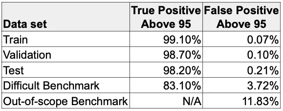
We expect the train-validation-test set results to be exceptional since our data is curated. So, as long as people take “good” pictures, the model should do very well. But to get a sense of how it does on extreme situations, let’s take a look at our benchmarks.
The “difficult” benchmark has more modest true positive and false positive rates, which reflects the fact that the images are more challenging. These values are much easier to compare across training runs, so that lets me set a min/max target. So for example, if I target a minimum of 80% for true positive, and maximum of 5% for false positive on this benchmark, then I can feel confident moving this to production.
The “out-of-scope” benchmark has no true positive rate because none of the images belong to any class the model can identify. Remember, we picked things like a bag of popcorn, etc., that are not zoo animals, so there cannot be any true positives. But we do get a false positive rate, which means the model gave a confident score to that bag of popcorn as some animal. And if we set a target maximum of 10% for this benchmark, then we may not want to move it to production.

Right now, you may be thinking, “Well, what animal did it pick for the bag of popcorn?” Excellent question! Now you understand the importance of doing a manual review of the images that get bad results.
Evaluation of the deployed model
The evaluation that I described above applies to a model immediately after training. Now, you want to evaluate how your model is doing in the real world. The process is similar, but requires you to shift to a “production mindset” and asking yourself, “Did the model get this correct?” and “Should it have gotten this correct?” and “Did we tell the user the right thing?”
So, imagine that you are logging in for the morning — after sipping on your cold brew coffee, of course — and are presented with 500 images that your zoo guests took yesterday of different animals. Your job is to determine how satisfied the guests were using your model to identify the zoo animals.
Using the softmax “confidence” score for each image, we have a threshold before presenting results. Above the threshold, we tell the guest what the model predicted. I’ll call this the “happy path”. And below the threshold is the “sad path” where we ask them to try again.
Your review interface will first show you all the “happy path” images one at a time. This is where you ask yourself, “Did we get this right?” Hopefully, yes!
But if not, this is where things get tricky. So now you have to ask, “Why not?” Here are some things that it could be:
- “Bad” picture — Poor lighting, bad angle, zoomed out, etc — refer to your labelling standards.
- Out-of-scope — It’s a zoo animal, but unfortunately one that isn’t found in this zoo. Maybe it belongs to another zoo (your guest likes to travel and try out your app). Consider adding these to your data set.
- Out-of-scope — It’s not a zoo animal. It could be an animal in your zoo, but not one typically contained there, like a neighborhood sparrow or mallard duck. This might be a candidate to add.
- Out-of-scope — It’s something found in the zoo. A zoo usually has interesting trees and shrubs, so people might try to identify those. Another candidate to add.
- Prankster — Completely out-of-scope. Because people like to play with technology, there’s the possibility you have a prankster that took a picture of a bag of popcorn, or a soft drink cup, or even a selfie. These are hard to prevent, but hopefully get a low enough score (below the threshold) so the model did not identify it as a zoo animal. If you see enough pattern in these, consider creating a class with special handling on the front-end.
After reviewing the “happy path” images, you move on to the “sad path” images — the ones that got a low confidence score and the app gave a “sorry, try again” message. This time you ask yourself, “Should the model have given this image a higher score?” which would have put it in the “happy path”. If so, then you want to ensure these images are added to the training set so next time it will do better. But most of time, the low score reflects many of the “bad” or out-of-scope situations mentioned above.
Perhaps your model performance is suffering and it has nothing to do with your model. Maybe it is the ways you users interacting with the app. Keep an eye out of non-technical problems and share your observations with the rest of your team. For example:
- Are your users using the application in the ways you expected?
- Are they not following the instructions?
- Do the instructions need to be stated more clearly?
- Is there anything you can do to improve the experience?
Collect statistics and new images
Both of the manual evaluations above open a gold mine of data. So, be sure to collect these statistics and feed them into a dashboard — your manager and your future self will thank you!
Keep track of these stats and generate reports that you and your can reference:
- How often the model is being called?
- What times of the day, what days of the week is it used?
- Are your system resources able to handle the peak load?
- What classes are the most common?
- After evaluation, what is the accuracy for each class?
- What is the breakdown for confidence scores?
- How many scores are above and below the confidence threshold?
The single best thing you get from a deployed model is the additional real-world images! You can add these now images to improve coverage of your existing zoo animals. But more importantly, they provide you insight on other classes to add. For example, let’s say people enjoy taking a picture of the large walrus statue at the gate. Some of these may make sense to incorporate into your data set to provide a better user experience.
Creating a new class, like the walrus statue, is not a huge effort, and it avoids the false positive responses. It would be more embarrassing to identify a walrus statue as an elephant! As for the prankster and the bag of popcorn, you can configure your front-end to quietly handle these. You might even get creative and have fun with it like, “Thank you for visiting the food court.”
Double-check process
It is a good idea to double-check your image set when you suspect there may be problems with your data. I’m not suggesting a top-to-bottom check, because that would a monumental effort! Rather specific classes that you suspect could contain bad data that is degrading your model performance.
Immediately after my training run completes, I have a script that will use this new model to generate predictions for my entire data set. When this is complete, it will take the list of incorrect identifications, as well as the low scoring predictions, and automatically feed that list into the Double-check interface.
This interface will show, one at a time, the image in question, alongside an example image of the ground truth and an example image of what the model predicted. I can visually compare the three, side-by-side. The first thing I do is ensure the original image is a “good” picture, following my labelling standards. Then I check if the ground-truth label is indeed correct, or if there is something that made the model think it was the predicted label.
At this point I can:
- Remove the original image if the image quality is poor.
- Relabel the image if it belongs in a different class.
During this manual evaluation, you might notice dozens of the same wrong prediction. Ask yourself why the model made this mistake when the images seem perfectly fine. The answer may be some incorrect labels on images in the ground truth, or even in the predicted class!
Don’t hesitate to add those classes and sub-classes back into the Double-check interface and step through them all. You may have 100–200 pictures to review, but there is a good chance that one or two of the images will stand out as being the culprit.
Up next…
With a different mindset for a trained model versus a deployed model, we can now evaluate performances to decide which models are ready for production, and how well a production model is going to serve the public. This relies on a solid Double-check process and a critical eye on your data. And beyond the “gut feel” of your model, we can rely on the benchmark scores to support us.
In Part 4, we kick off the training run, but there are some subtle techniques to get the most out of the process and even ways to leverage throw-away models to expand your library image data.