Stay Ahead, Stay ONMINE

Heatmaps for Time Series

In 2015, the Wall Street Journal (WSJ) published a highly effective series of heatmaps illustrating the impact of vaccines on infectious diseases in the United States. These visualizations showcased the power of blanket policies to drive widespread change. You can view the heatmaps here. Heatmaps are a versatile tool for data analysis. Their ability to facilitate comparative analysis, highlight temporal trends, and enable pattern recognition makes them invaluable for communicating complex information.  In this Quick Success Data Science project, we’ll use Python’s Matplotlib graphing library to recreate the WSJ’s measles chart, demonstrating how to leverage heatmaps and carefully designed colorbars to influence data storytelling. The data  The disease data comes from the University of Pittsburgh’s Project Tycho. This organization works with national and global health institutes and researchers to make data easier to use to improve global health. The measles data is available under a Creative Commons Attribution 4.0 International Public License.  For convenience, I’ve downloaded the data from Project Tycho’s data portal to a CSV file and stored it in this Gist. Later, we’ll access it programmatically through the code. The measles heatmap We’ll use the Matplotlib pcolormesh() function to construct a close facsimile of the WSJ measles heatmap. While other libraries, such as Seaborn, Plotly Express, and hvplot, include dedicated heatmap functions, these are built for ease of use, with most of the design decisions abstracted away. This makes it difficult to force their results to match the WSJ heatmap.  Besides pcolormesh(), Matplotlib’s imshow() function (for “image show”) can also produce heatmaps. The pcolormesh function, however, better aligns gridlines with cell edges.  Here’s an example of a heatmap made with imshow() that you compare to the pcolormesh() results later. The main difference is the lack of gridlines. Measles incidence heatmap built with Matplotlib’s imshow()function (by the author) In 1963, the measles vaccine was licensed and released across America with widespread uptake. Within five years, the incidence of the disease was greatly reduced. By 2000, measles had been considered eradicated in the United States, with any new cases arriving from outside the country. Notice how well the visualization conveys this “big picture” while preserving the state-level details. This is due in no small part to the choice of colorbar. The colors used in the visualization are biased. More than 80% of the colorbar is composed of warm colors, and (light) blue is reserved for the smallest values. This makes it easy to demarcate the pre- and post-vaccination periods. White cells denote missing data, represented by NaN (Not a Number) values.  Compare the previous heatmap to one built with a more balanced colorbar: The heatmap using a more balanced colorbar (by the author) The darker blue color not only overpowers the plot, it’s hard on the eyes. And while it’s still possible to see the effect of the vaccine, the visual impact is far more subtle than in the plot with the biased colorbar. Alternately, it’s easier to parse higher values but at the expense of the overall theme. The code The following code was written in JupyterLab and is presented by cell. Importing libraries The first cell imports the libraries we’ll need to complete the project. An online search for the library names will lead you to the installation instructions. import numpy as np import matplotlib.pyplot as plt from matplotlib.colors import LinearSegmentedColormap, Normalize from matplotlib.cm import ScalarMappable import pandas as pd Creating the custom colormap The following code closely reproduces the colormap used by the WSJ. I used the online Image Color Picker tool to identify the key colors from a screenshot of their measles heatmap and adjusted these based on colors chosen for a similar tutorial built for R. # Normalize RGB colors: colors = [‘#e7f0fa’, # lightest blue ‘#c9e2f6’, # light blue ‘#95cbee’, # blue ‘#0099dc’, # dark blue ‘#4ab04a’, # green ‘#ffd73e’, # yellow ‘#eec73a’, # yellow brown ‘#e29421’, # dark tan ‘#f05336’, # orange ‘#ce472e’] # red # Create a list of positions for each color in the colormap: positions = [0, 0.02, 0.03, 0.09, 0.1, 0.15, 0.25, 0.4, 0.5, 1] # Create a LinearSegmentedColormap (continuous colors): custom_cmap = LinearSegmentedColormap.from_list(‘custom_colormap’, list(zip(positions, colors))) # Display a colorbar with the custom colormap: fig, ax = plt.subplots(figsize=(6, 1)) plt.imshow([list(range(256))], cmap=custom_cmap, aspect=’auto’, vmin=0, vmax=255) plt.xticks([]), plt.yticks([]) plt.show() Here’s the generic colorbar produced by the code: The colorbar based on the WSJ measles heatmap (by author) This code makes a continuous colormap using Matplotlib’s LinearSegmentedColormap() class. This class specifies colormaps using anchor points between which RGB(A) values are interpolated. That is, it generates colormap objects based on lookup tables using linear segments. It creates the lookup table using linear interpolation for each primary color, with the 0–1 domain divided into any number of segments. For more details, see this short tutorial on making custom colormaps with Matplotlib. Loading and prepping the disease data Next, we load the CSV file into pandas and prep it for plotting. This file contains the incidence of measles (as the number of cases per 100,000 people) for each state (and the District of Columbia) by week from 1928 to 2003. We’ll need to convert the values to a numeric data type, aggregate the data by year, and reshape the DataFrame for plotting. # Read the csv file into a DataFrame: url = ‘https://bit.ly/3F47ejX’ df_raw = pd.read_csv(url) # Convert to numeric and aggregate by year: df_raw.iloc[:, 2:] = (df_raw.iloc[:, 2:] .apply(pd.to_numeric, errors=’coerce’)) df = (df_raw.groupby(‘YEAR’, as_index=False) .sum(min_count=1, numeric_only=True) .drop(columns=[‘WEEK’])) # Reshape the data for plotting: df_melted = df.melt(id_vars=’YEAR’, var_name=’State’, value_name=’Incidence’) df_pivot = df_melted.pivot_table(index=’State’, columns=’YEAR’, values=’Incidence’) # Reverse the state order for plotting: df_pivot = df_pivot[::-1] Here’s how the initial (raw) DataFrame looks, showing the first five rows and ten columns: Part of the head of the df_raw DataFrame (by author) NaN values are represented by a dash (-).  The final df_pivot DataFrame is in wide format, where each column represents a variable, and rows represent unique entities: Part of the head of the dv_pivot DataFrame (by author) While plotting is generally performed using long format data, as in the df_raw DataFrame, pcolormesh() prefers wide format when making heatmaps. This is because heatmaps are inherently designed to display a 2D matrix-like structure, where rows and columns represent distinct categories. In this case, the final plot will look much like the DataFrame, with states along the y-axis and years along the x-axis. Each cell of the heatmap will be colored based on the numerical values. Handling missing values  The dataset contains a lot of missing values. We’ll want to distinguish these from 0 values in the heatmap by making a mask to identify and store these NaN values. Before applying this mask with NumPy, we’ll use Matplotlib’s Normalize() class to normalize the data. This way, we can directly compare the heatmap colors across states. # Create a mask for NaN values: nan_mask = df_pivot.isna() # Normalize the data for a shared colormap: norm = Normalize(df_pivot.min().min(), df_pivot.max().max()) # Apply normalization before masking: normalized_data = norm(df_pivot) # Create masked array from normalized data: masked_data = np.ma.masked_array(normalized_data, mask=nan_mask) Plotting the heatmap The following code creates the heatmap. The heart of it consists of the single line calling the pcolormesh() function. Most of the rest embellishes the plot so that it looks like the WSJ heatmap (with the exception of the x, y, and colorbar labels, which are greatly improved in our version). # Plot the data using pcolormesh with a masked array: multiplier = 0.22 # Changes figure aspect ratio fig, ax = plt.subplots(figsize=(11, len(df_pivot.index) * multiplier)) states = df_pivot.index years = df_pivot.columns im = plt.pcolormesh(masked_data, cmap=custom_cmap, edgecolors=’w’, linewidth=0.5) ax.set_title(‘Measles Incidence by State (1928-2002)’, fontsize=16) # Adjust x-axis ticks and labels to be centered: every_other_year_indices = np.arange(0, len(years), 2) + 0.5 ax.set_xticks(every_other_year_indices) ax.set_xticklabels(years[::2], rotation=’vertical’, fontsize=10) # Adjust labels on y-axis: ax.set_yticks(np.arange(len(states)) + 0.5) # Center ticks in cells ax.set_yticklabels(states, fontsize=9) # Add vertical line and label for vaccine date: vaccine_year_index = list(years).index(1963) ax.axvline(x=vaccine_year_index, linestyle=’–‘, linewidth=1, color=’k’) alaska_index = states.get_loc(‘ALASKA’) ax.text(vaccine_year_index, alaska_index, ‘ Vaccine’, ha=’left’, va=’center’, fontweight=’bold’) # Add a colorbar: cbar = fig.colorbar(ScalarMappable(norm=norm, cmap=custom_cmap), ax=ax, orientation=’horizontal’, pad=0.1, label=’Cases per 100,000′) cbar.ax.xaxis.set_ticks_position(‘bottom’) plt.savefig(‘measles_pcolormesh_nan.png’, dpi=600, bbox_inches=’tight’) plt.show() Here’s the result: Measles incidence heatmap built with Matplotlib’s pcolormesh() function (by the author) This is a close approximation of the WSJ heatmap, with what I consider more legible labels and better separation of 0 and NaN (missing data) values.  Uses for heatmaps Heatmaps are highly effective at demonstrating how a blanket policy or action impacts multiple geographic regions over time. Thanks to their versatility, they can be adapted for other purposes, such as tracking: Air quality index levels in different cities before and after the Clean Air Act Change in test scores for schools or districts after policies like No Child Left Behind Unemployment rates for different regions after economic stimulus packages Product sales performance by region after local or nationwide ad campaigns Among the advantages of heatmaps is that they promote multiple analysis techniques. These include: Comparative Analysis: easily compare trends across different categories ( states, schools, regions, etc.). Temporal Trends: elegantly show how values change over time. Pattern Recognition: identify patterns and anomalies in the data at a glance. Communication: Provide a clear and concise way to communicate complex data. Heatmaps are a great way to present a big-picture overview while preserving the data’s fine-scale granularity.

In 2015, the Wall Street Journal (WSJ) published a highly effective series of heatmaps illustrating the impact of vaccines on infectious diseases in the United States. These visualizations showcased the power of blanket policies to drive widespread change. You can view the heatmaps here.

Heatmaps are a versatile tool for data analysis. Their ability to facilitate comparative analysis, highlight temporal trends, and enable pattern recognition makes them invaluable for communicating complex information. 

In this Quick Success Data Science project, we’ll use Python’s Matplotlib graphing library to recreate the WSJ’s measles chart, demonstrating how to leverage heatmaps and carefully designed colorbars to influence data storytelling.

The data 

The disease data comes from the University of Pittsburgh’s Project Tycho. This organization works with national and global health institutes and researchers to make data easier to use to improve global health. The measles data is available under a Creative Commons Attribution 4.0 International Public License

For convenience, I’ve downloaded the data from Project Tycho’s data portal to a CSV file and stored it in this Gist. Later, we’ll access it programmatically through the code.

The measles heatmap

We’ll use the Matplotlib pcolormesh() function to construct a close facsimile of the WSJ measles heatmap. While other libraries, such as Seaborn, Plotly Express, and hvplot, include dedicated heatmap functions, these are built for ease of use, with most of the design decisions abstracted away. This makes it difficult to force their results to match the WSJ heatmap. 

Besides pcolormesh(), Matplotlib’s imshow() function (for “image show”) can also produce heatmaps. The pcolormesh function, however, better aligns gridlines with cell edges. 

Here’s an example of a heatmap made with imshow() that you compare to the pcolormesh() results later. The main difference is the lack of gridlines.
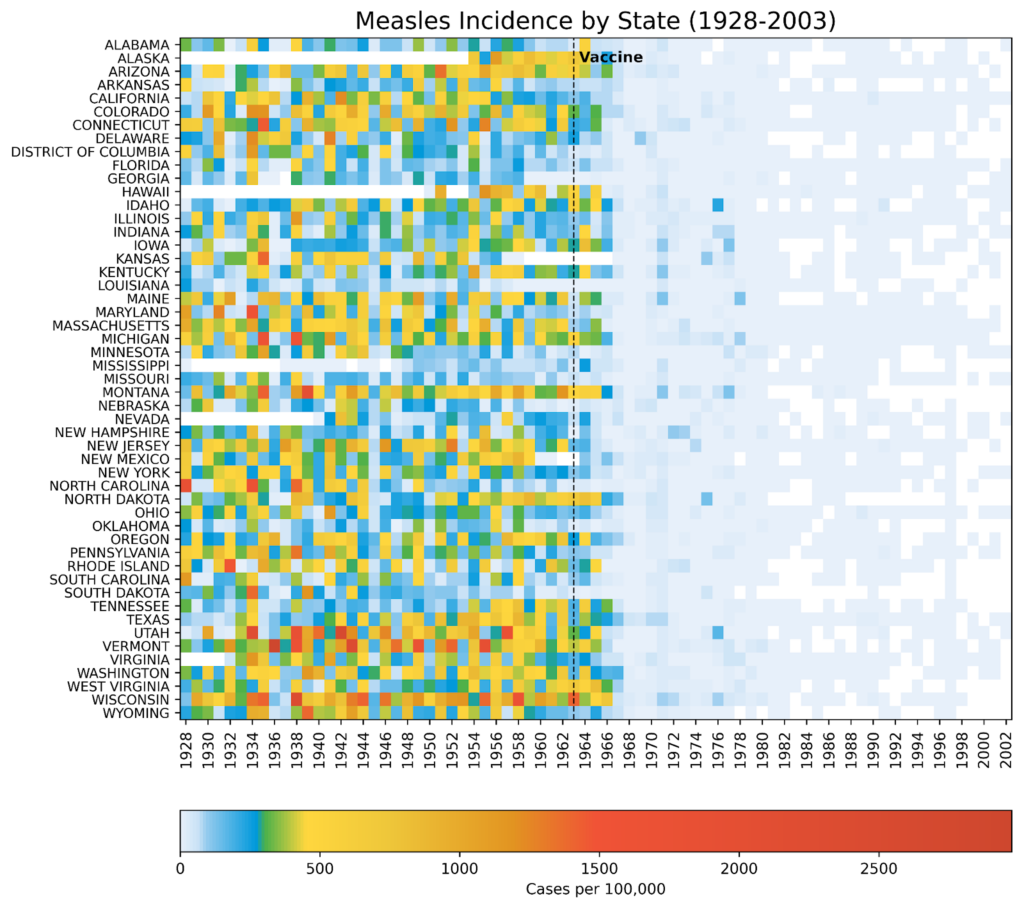
Measles incidence heatmap built with Matplotlib’s imshow()function (by the author)

In 1963, the measles vaccine was licensed and released across America with widespread uptake. Within five years, the incidence of the disease was greatly reduced. By 2000, measles had been considered eradicated in the United States, with any new cases arriving from outside the country. Notice how well the visualization conveys this “big picture” while preserving the state-level details. This is due in no small part to the choice of colorbar.

The colors used in the visualization are biased. More than 80% of the colorbar is composed of warm colors, and (light) blue is reserved for the smallest values. This makes it easy to demarcate the pre- and post-vaccination periods. White cells denote missing data, represented by NaN (Not a Number) values. 

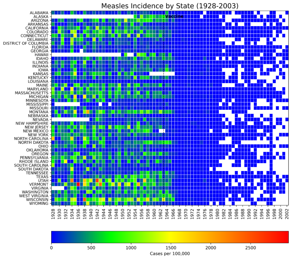
Compare the previous heatmap to one built with a more balanced colorbar:
Heatmap
The heatmap using a more balanced colorbar (by the author)

The darker blue color not only overpowers the plot, it’s hard on the eyes. And while it’s still possible to see the effect of the vaccine, the visual impact is far more subtle than in the plot with the biased colorbar. Alternately, it’s easier to parse higher values but at the expense of the overall theme.

The code

The following code was written in JupyterLab and is presented by cell.

Importing libraries

The first cell imports the libraries we’ll need to complete the project. An online search for the library names will lead you to the installation instructions.

import numpy as np
import matplotlib.pyplot as plt
from matplotlib.colors import LinearSegmentedColormap, Normalize
from matplotlib.cm import ScalarMappable
import pandas as pd

Creating the custom colormap

The following code closely reproduces the colormap used by the WSJ. I used the online Image Color Picker tool to identify the key colors from a screenshot of their measles heatmap and adjusted these based on colors chosen for a similar tutorial built for R.

# Normalize RGB colors:
colors = ['#e7f0fa',  # lightest blue
          '#c9e2f6',  # light blue
          '#95cbee',  # blue
          '#0099dc',  # dark blue
          '#4ab04a',  # green
          '#ffd73e',  # yellow
          '#eec73a',  # yellow brown
          '#e29421',  # dark tan
          '#f05336',  # orange
          '#ce472e']  # red

# Create a list of positions for each color in the colormap:
positions = [0, 0.02, 0.03, 0.09, 0.1, 0.15, 0.25, 0.4, 0.5, 1]

# Create a LinearSegmentedColormap (continuous colors):
custom_cmap = LinearSegmentedColormap.from_list('custom_colormap', 
                                                list(zip(positions, 
                                                         colors)))

# Display a colorbar with the custom colormap:
fig, ax = plt.subplots(figsize=(6, 1))

plt.imshow([list(range(256))],
           cmap=custom_cmap, 
           aspect='auto', 
           vmin=0, vmax=255)

plt.xticks([]), plt.yticks([])
plt.show()

Here’s the generic colorbar produced by the code:

The colorbar based on the WSJ measles heatmap (by author)

This code makes a continuous colormap using Matplotlib’s LinearSegmentedColormap() class. This class specifies colormaps using anchor points between which RGB(A) values are interpolated. That is, it generates colormap objects based on lookup tables using linear segments. It creates the lookup table using linear interpolation for each primary color, with the 0–1 domain divided into any number of segments. For more details, see this short tutorial on making custom colormaps with Matplotlib.

Loading and prepping the disease data

Next, we load the CSV file into pandas and prep it for plotting. This file contains the incidence of measles (as the number of cases per 100,000 people) for each state (and the District of Columbia) by week from 1928 to 2003. We’ll need to convert the values to a numeric data type, aggregate the data by year, and reshape the DataFrame for plotting.

# Read the csv file into a DataFrame:
url = 'https://bit.ly/3F47ejX'
df_raw = pd.read_csv(url)

# Convert to numeric and aggregate by year:
df_raw.iloc[:, 2:] = (df_raw.iloc[:, 2:]
                      .apply(pd.to_numeric, 
                             errors='coerce'))

df = (df_raw.groupby('YEAR', as_index=False)
        .sum(min_count=1, numeric_only=True)
        .drop(columns=['WEEK']))

# Reshape the data for plotting:
df_melted = df.melt(id_vars='YEAR',
                    var_name='State',
                    value_name='Incidence')

df_pivot = df_melted.pivot_table(index='State',
                                 columns='YEAR',
                                 values='Incidence')

# Reverse the state order for plotting:
df_pivot = df_pivot[::-1]

Here’s how the initial (raw) DataFrame looks, showing the first five rows and ten columns:
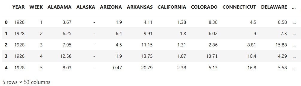
Part of the head of the df_raw DataFrame (by author)

NaN values are represented by a dash (-). 

The final df_pivot DataFrame is in wide format, where each column represents a variable, and rows represent unique entities:
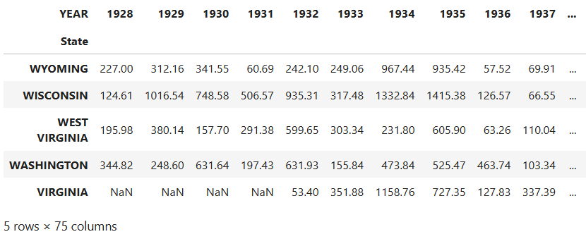
Part of the head of the dv_pivot DataFrame (by author)

While plotting is generally performed using long format data, as in the df_raw DataFrame, pcolormesh() prefers wide format when making heatmaps. This is because heatmaps are inherently designed to display a 2D matrix-like structure, where rows and columns represent distinct categories. In this case, the final plot will look much like the DataFrame, with states along the y-axis and years along the x-axis. Each cell of the heatmap will be colored based on the numerical values.

Handling missing values 

The dataset contains a lot of missing values. We’ll want to distinguish these from 0 values in the heatmap by making a mask to identify and store these NaN values. Before applying this mask with NumPy, we’ll use Matplotlib’s Normalize() class to normalize the data. This way, we can directly compare the heatmap colors across states.

# Create a mask for NaN values:
nan_mask = df_pivot.isna()

# Normalize the data for a shared colormap:
norm = Normalize(df_pivot.min().min(), df_pivot.max().max())

# Apply normalization before masking:
normalized_data = norm(df_pivot)

# Create masked array from normalized data:
masked_data = np.ma.masked_array(normalized_data, mask=nan_mask)

Plotting the heatmap

The following code creates the heatmap. The heart of it consists of the single line calling the pcolormesh() function. Most of the rest embellishes the plot so that it looks like the WSJ heatmap (with the exception of the x, y, and colorbar labels, which are greatly improved in our version).

# Plot the data using pcolormesh with a masked array:
multiplier = 0.22  # Changes figure aspect ratio
fig, ax = plt.subplots(figsize=(11, len(df_pivot.index) * multiplier))

states = df_pivot.index
years = df_pivot.columns

im = plt.pcolormesh(masked_data, cmap=custom_cmap, 
                    edgecolors='w', linewidth=0.5)

ax.set_title('Measles Incidence by State (1928-2002)', fontsize=16)

# Adjust x-axis ticks and labels to be centered:
every_other_year_indices = np.arange(0, len(years), 2) + 0.5
ax.set_xticks(every_other_year_indices)
ax.set_xticklabels(years[::2], rotation='vertical', fontsize=10)

# Adjust labels on y-axis:
ax.set_yticks(np.arange(len(states)) + 0.5)  # Center ticks in cells
ax.set_yticklabels(states, fontsize=9)

# Add vertical line and label for vaccine date:
vaccine_year_index = list(years).index(1963)
ax.axvline(x=vaccine_year_index, linestyle='--', 
           linewidth=1, color='k')
alaska_index = states.get_loc('ALASKA')
ax.text(vaccine_year_index, alaska_index, ' Vaccine', 
        ha='left', va='center', fontweight='bold')

# Add a colorbar:
cbar = fig.colorbar(ScalarMappable(norm=norm, cmap=custom_cmap), 
                    ax=ax, orientation='horizontal', pad=0.1, 
                    label='Cases per 100,000')
cbar.ax.xaxis.set_ticks_position('bottom')

plt.savefig('measles_pcolormesh_nan.png', dpi=600, bbox_inches='tight')
plt.show()

Here’s the result:
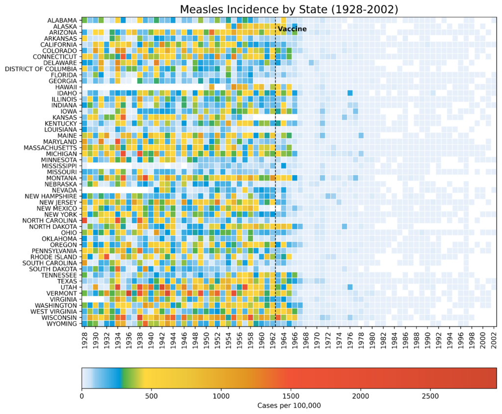
Measles incidence heatmap built with Matplotlib’s pcolormesh() function (by the author)

This is a close approximation of the WSJ heatmap, with what I consider more legible labels and better separation of 0 and NaN (missing data) values. 

Uses for heatmaps

Heatmaps are highly effective at demonstrating how a blanket policy or action impacts multiple geographic regions over time. Thanks to their versatility, they can be adapted for other purposes, such as tracking:

  • Air quality index levels in different cities before and after the Clean Air Act
  • Change in test scores for schools or districts after policies like No Child Left Behind
  • Unemployment rates for different regions after economic stimulus packages
  • Product sales performance by region after local or nationwide ad campaigns

Among the advantages of heatmaps is that they promote multiple analysis techniques. These include:

Comparative Analysis: easily compare trends across different categories ( states, schools, regions, etc.).

Temporal Trends: elegantly show how values change over time.

Pattern Recognition: identify patterns and anomalies in the data at a glance.

Communication: Provide a clear and concise way to communicate complex data.

Heatmaps are a great way to present a big-picture overview while preserving the data’s fine-scale granularity.


Shape
Shape
Stay Ahead

Explore More Insights

Stay ahead with more perspectives on cutting-edge power, infrastructure, energy,  bitcoin and AI solutions. Explore these articles to uncover strategies and insights shaping the future of industries.

Shape

Arista debuts unified SD-WAN edge platform

“Multi-vendor branch complexity creates the ultimate blind spot, and your adversaries are actively hiding in it,” wrote Brendan Gibbs, Arista’s vice president, AI, routing, and switching platforms, in a blog post about the new platform. Sprawling multi-vendor infrastructure creates operational headaches and increases security risks, according to Gibbs. “When you

Read More »

Helios marks AMD’s biggest AI infrastructure push yet

The architecture behind Helios The launch of Helios marks AMD’s latest attempt to strengthen its position in a market where Nvidia continues to dominate AI infrastructure. Unlike previous AMD AI offerings centred on individual accelerators, Helios is designed as a complete rack-scale system integrating compute, networking and software. According to

Read More »

United States and Saudi Arabia Reach Historic Nuclear Cooperation Agreement

WASHINGTON—U.S. Secretary of Energy Chris Wright and Saudi Minister of Energy His Royal Highness (HRH) Prince Abdulaziz bin Salman signed a peaceful nuclear cooperation agreement, commonly known as a 123 agreement, alongside an accompanying bilateral safeguards agreement. Together, these two agreements lay the legal foundation for a decades-long, multi-billion-dollar partnership that advances several priority economic and strategic objectives, including nuclear nonproliferation. The 123 agreement provides great access for American companies in the Saudi nuclear energy program, benefiting American industry, workers, and supply chains while helping to meet Saudi energy needs. The two agreements also advance U.S. and regional security by upholding high standards of nuclear safety, security, and nonproliferation and strengthening the United States’ competitive edge in civil nuclear technology. “These agreements reflect our two nations’ shared commitment to strengthening U.S.-Saudi commercial relations, delivering prosperity at home and security to our allies abroad,” said Secretary Wright. “Rest assured, these agreements uphold the highest standards of nuclear safety and nonproliferation, while relying on the world’s best nuclear technology and scientists, designed right here in the United States. Thanks to President Trump, the American nuclear renaissance is underway and will deliver long-term benefits to the American and Saudi people.” Under President Trump’s leadership, America is restoring its competitive edge in the global civil nuclear marketplace. This agreement builds on President Trump’s Executive Order, Deploying Advanced Nuclear Reactor Technologies for National Security, and specifically Section 8 on Promoting American Nuclear Exports, which supports an expansion of international partners for U.S. civil nuclear cooperation under Section 123 of the Atomic Energy Act of 1954, as amended. This partnership will: Expand American nuclear technology exports Create high-paying U.S. jobs and long-term economic growth Strengthen America’s energy and national security posture Reinforce global nonproliferation standards Deepen the strategic partnership between the United States and the Kingdom of

Read More »

Secretary of Energy Chris Wright Announces First Genesis Mission Projects Selected to Accelerate AI-Driven Scientific Discovery

WASHINGTON—The U.S. Department of Energy (DOE) today announced the first projects selected under the Genesis Mission Request for Applications (RFA) as part of President Trump’s historic Genesis Mission. The national portfolio of research teams will help develop and demonstrate AI-enabled scientific workflows designed to accelerate breakthroughs in energy, discovery science, and national security. Designed to double America’s scientific productivity, the Genesis Mission brings together DOE’s world-class scientific capabilities, advanced AI, high-performance computing, and the nation’s leading researchers to transform how scientific discovery is conducted and strengthen American leadership in science and technology. “America has no shortage of bold ideas or talented scientists, and the response to the Genesis Mission proves that,” said U.S. Secretary of Energy Chris Wright. “The 278 projects selected today represent the very best of our nation’s scientific enterprise. The remarkable number of high-quality proposals we received demonstrates that America’s innovation pipeline is strong, and it points to even greater opportunities for future investment and continued expansion of the Genesis Mission portfolio.” The Genesis Mission RFA generated the largest response to a funding opportunity in DOE history. Following a rigorous merit review process, the selected projects represent: 278 awards: 87 led by DOE and National Nuclear Security Administration (NNSA) National Laboratories, 168 led by universities, 19 led by companies, and 4 led by nonprofit organizations. 342 participating institutions: 16 DOE and NNSA National Laboratories, 142 universities, 157 companies, 13 nonprofit organizations, and 14 other institutions. These projects will address some of the nation’s most pressing energy, scientific, and engineering challenges, including in nuclear energy, critical mineral extraction, intelligent chip design, and commercial fusion energy.  Among the selected projects, the largest is a three-year, $60 million investment in nuclear energy that will harness AI to help deliver nuclear facilities faster and safer while cutting operating costs to provide Americans with affordable, reliable, and secure energy.

Read More »

DOE and DOL Partner to Advance Mining Innovation and Safety

WASHINGTON—The U.S. Department of Energy (DOE) and the U.S. Department of Labor (DOL) today signed a Memorandum of Understanding (MOU) establishing a framework to accelerate the deployment of artificial intelligence (AI), automation, advanced sensors, and other emerging technologies across the nation’s mining sector. The five-year agreement strengthens federal coordination to advance mining innovation while improving worker safety, increasing productivity, and supporting the secure domestic production of critical minerals. By combining DOE’s expertise in energy technologies and resource recovery with DOL’s longstanding leadership in mine safety, the partnership advances the Trump Administration’s commitment to strengthen critical mineral supply chains, support high-paying American jobs, and unleash American energy dominance “America’s security and economic future depend on developing a strong domestic mining sector,” said U.S. Secretary of Energy Chris Wright. “By pairing the Energy Department’s technical expertise with the Labor Department’s leadership on mine safety, we can support American miners, secure domestic supply chains, and put cutting-edge technology to work for the people who power our nation.” “Today’s agreement ensures that the Department of Labor and the Department of Energy will work side by side to prepare the mining workforce, advance mining technology, and support the safe production of the coal that powers America’s future,” said Acting Secretary of Labor Keith Sonderling. “It is our commitment to you that this MOU will further President Trump’s promise to restore coal as a key driver of America’s energy supply chain and American coal will again be the envy of the world for generations to come.” Under the agreement, DOE’s Hydrocarbons and Geothermal Energy Office (HGEO) and Office of Critical Minerals and Energy Innovation (CMEI) will collaborate closely with DOL’s Mine Safety and Health Administration (MSHA) to share non-proprietary data, research, and technical expertise that supports the deployment of next-generation mining technologies. The partnership will focus

Read More »

Energy Secretary Secures Grid Amid Period of Hot Weather

WASHINGTON—The U.S. Department of Energy (DOE) issued an emergency order to mitigate blackout risks and keep Americans powered during the region’s energy emergency brought on by hot weather conditions. The order directs the Southwest Power Pool, Inc. (SPP) to dispatch specified units and to order their operation as needed to maintain reliability. The order also authorizes SPP to direct backup generation resources to operate as a last resort before declaring an Energy Emergency Alert (EEA) 3 or during an EEA 3. The order was issued pursuant to a request from SPP. “The Trump Administration is tapping into an abundant supply of unused backup generation to maintain affordable, reliable, and secure power for hardworking American families and businesses,” said U.S. Secretary of Energy Chris Wright. “The previous administration’s energy subtraction policies weakened the grid, leaving Americans more vulnerable during emergency events. Thanks to President Trump’s leadership, we are reversing those failures and using every available tool to ensure Americans have continued access to affordable, reliable, and secure energy to power and cool their homes.”  DOE estimates more than 35 gigawatts (GW) of unused backup generation remains available nationwide.   On day one of his second term, President Trump declared a national energy emergency after the Biden administration’s energy subtraction agenda left behind a grid increasingly vulnerable to blackouts.   Power outages cost the American people $44 billion per year, according to data from DOE’s National Laboratories. This order mitigates the possibility of power outages in the region and highlights the common sense policies of the Trump Administration to ensure Americans have access to affordable, reliable, and secure power. The order was effective upon issuance on July 20, 2026, and shall expire at 11:59 PM ET on July 21, 2026. 

Read More »

S&P Global: Hormuz vessel transits fall amid heightened security risks

Vessel traffic through the Strait of Hormuz remained subdued July 10-12 as heightened regional security risks continued to weigh on movements through the strategic waterway, according to S&P Global MINT and S&P Global Commodities at Sea data. A total of 73 vessels transited the strait during the 3-day period, averaging fewer than 25 crossings/day. Transits fell to 11 on July 12, the lowest since June 14, after Iran declared the strait closed amid what the Persian Gulf Strait Authority described as “illegal movements” of US military forces in the region. No inbound crossings were recorded July 12, the first such occurrence since June 12. Six of the day’s 11 transits were assessed as compliant vessels. Total crossings were 32 on July 10 and 30 on July 11. The Joint Maritime Information Center (JMIC) said July 12 that the regional threat level remained severe. Despite Iran’s closure declaration, JMIC said the southern route remained available and had been expanded for two-way vessel traffic. Energy carriers—including oil, chemical, LPG, and LNG tankers—accounted for about 48% of transits July 10-12. About two-thirds of energy-carrier crossings involved compliant vessels, although only 10 compliant energy carriers entered the Persian Gulf, mostly without visible automatic identification system (AIS) signals. Inbound tanker capacity also softened. An average 6.5 million b/d of new oil and LPG tanker capacity entered the Gulf through Hormuz July 1-12, with VLCCs and Suezmaxes accounting for nearly 80%. Average inbound capacity fell to 6 million b/d July 10-12 from 8.5 million b/d in the first week of July. All compliant outbound energy carriers transiting Hormuz during the 3-day period did so without visible AIS signals, including ADNOC-operated LNG carrier AL HAMRA and several VLCC and product tankers. Iran-linked and US-sanctioned vessels accounted for nearly 60% of all crossings during the period.

Read More »

Beyond AI Pilots: Scaling AI-Enabled Decision Making in Energy

Date: Thursday, August 6, 2026Time: 11:00 AM (GMT-04:00) Eastern Time – New YorkDuration: 60 minutes Already registered? Click here to log in now. Artificial Intelligence is rapidly becoming a strategic priority across industrial organizations, yet many companies continue to struggle with fragmented data, disconnected workflows, and AI initiatives that never move beyond pilot projects. The challenge is not access to AI—it is creating the business context, governance, and lifecycle intelligence needed to transform AI insights into measurable operational outcomes. Join Siemens Digital Industries Software to learn how Intelligence Center X, part of the Siemens Xcelerator portfolio, helps organizations connect enterprise data, workflows, and AI capabilities into a single governed environment where people and AI work together to drive faster, more informed decisions. In this session, we’ll explore how organizations can: • Move beyond isolated AI experiments to enterprise-scale deployment • Connect engineering, manufacturing, operations, supply chain, and service data into a unified intelligence framework • Enable AI agents to operate within governed, human-in-the-loop business processes • Improve operational performance through AI-assisted decision-making • Accelerate issue resolution, reduce manual effort, and increase organizational agility Attendees will also learn how Intelligence Center X combines lifecycle intelligence, industrial data models, AI orchestration, and low-code application development to create production-ready AI solutions that deliver measurable business value. Real-world examples will demonstrate how organizations have achieved significant improvements, including reductions in manual effort, faster issue resolution, improved data quality, and enhanced decision-making capabilities. Whether you are responsible for digital transformation, operations, manufacturing, engineering, or executive strategy, this webinar will provide practical insight into building a scalable foundation for industrial AI and creating a future where people and AI work together to drive business outcomes.

Read More »

10 Reasons You Cannot Afford to Miss DCF Trends Summit 2026

The data center industry has no shortage of AI infrastructure ambition. What it lacks is certainty. Power is harder to secure. Designs are advancing faster than facilities can be built. Supply chains remain vulnerable. Liquid cooling is adding operational demands. Projects that look viable on paper can still stall on permitting, commissioning or community opposition. The question in 2026 is no longer how large the AI opportunity may become. It is what can actually be delivered, and who has learned how to deliver it. That question defines the 2026 Data Center Frontier Trends Summit, August 4–6 at the Hyatt Regency Reston. Across three days, the people building, powering, financing and operating next-generation infrastructure will examine what is working, where execution is failing and how the market is responding. This is not a conference about whether AI will create demand. It is about who will be able to meet it. The advantage will belong to those who join the conversation before its conclusions become market consensus. Here are 10 reasons to be in the room. 1. The industry has entered the execution era For several years, the market has been defined by projected demand, capacity, density and investment. The next phase will be defined by execution. AI data center announcements remain abundant. Energized, commissioned and operational capacity is harder to find. DCFTS begins with a live editorial calibration, followed by “The New Geography of AI,” featuring EdgeCore CEO Lee Kestler, Data Center Frontier founder Rich Miller and DCF Editor in Chief Matt Vincent. The focus: how power, entitled land, utility partnerships and execution speed are determining where AI capacity can be built—and who can deliver it. Demand creates opportunity. Execution determines who captures it. 2. Power will be treated as the foundation of AI strategy Power is no longer one workstream

Read More »

Time to Power: Sage Geosystems CEO Cindy Taff on Geothermal’s AI Infrastructure Moment

Three years ago, the data center industry’s energy conversation was largely framed around emissions. Hyperscale operators were setting carbon-free energy targets, signing renewable power agreements, and aligning their expanding infrastructure portfolios with corporate sustainability commitments. The arrival of generative AI has not eliminated those priorities. But it has reordered them. “Three years ago, data center energy, they were really focused on low emissions, no emissions,” said Cindy Taff, CEO of Sage Geosystems. “Now the primary challenge is just enough energy.” Speaking on the Data Center Frontier Show podcast, Taff described an energy market being reshaped by the speed and physical scale of AI infrastructure development. After decades of relatively flat U.S. electricity demand, AI has introduced a new class of concentrated, rapidly arriving industrial load. The result is a shift away from thinking only about how much generating capacity exists in aggregate and toward a harder question: Can usable power be delivered at a specific site, on a predictable schedule, in the quantities an AI campus requires? For hyperscalers, neocloud providers, data center developers, utilities, and energy companies, that distinction is becoming central to project execution. “I think time to power is the most precious metric right now versus cost or total capacity,” Taff said. Capacity on Paper Is Not Power at the Site Announcements of new generation can create the appearance of an energy system capable of meeting rising data center demand. But a megawatt located far from a planned campus, trapped behind a transmission constraint, or unavailable until the next decade has limited value to a developer trying to energize an AI facility within several years. “Aggregate capacity is not going to solve the problem if the power really isn’t where and when you need it,” Taff said. Data centers are large physical facilities tied to specific parcels,

Read More »

Tech Explainer: Data Center Cooling – Air, Evaporative, Liquid, and Hybrid Approaches

Data Center Cooling Glossary The following definitions reflect common terminology used in Department of Energy guidance, ASHRAE TC 9.9 materials, Berkeley Lab resources and Green Grid efficiency metrics. Adiabatic Cooling — A cooling process that uses water evaporation to lower the temperature of air before it reaches a heat exchanger or cooling coil. It can reduce compressor demand but consumes water when evaporative assistance is active. Air-Cooled Data Center — A facility in which heat is removed from IT equipment primarily by moving conditioned air through servers, even if that heat is later transferred to water or refrigerant elsewhere in the cooling system. Air Handler — Equipment that moves, filters and conditions air before delivering it to a data hall or other controlled space. Air-Side Economizer — A system that uses suitable outdoor air, either directly or mixed with return air, to reduce or avoid compressor-based refrigeration. Airflow Management — The practice of delivering conditioned air where it is needed while preventing hot exhaust air from recirculating into server inlets. Approach Temperature — The temperature difference between the two fluids leaving a heat exchanger at their closest thermal point. In a cooling tower, it commonly refers to the difference between leaving-water temperature and entering-air wet-bulb temperature. A smaller approach generally indicates more effective heat transfer. ASHRAE TC 9.9 — The ASHRAE technical committee focused on mission-critical facilities, data centers, technology spaces and electronic equipment. It is a major source of environmental and thermal guidance for data center operators and equipment manufacturers. Blanking Panel — A panel installed in unused rack spaces to prevent hot exhaust air from recirculating to server intakes. British Thermal Unit, or BTU — A unit of heat energy commonly used to express the heating or cooling capacity of equipment. Cabinet — An enclosure, also commonly called

Read More »

The AI Infrastructure Split Screen: Capital Rush Meets Community Resistance

It would be difficult to construct a more revealing snapshot of the AI infrastructure market than the one delivered in mid-July. In the same news cycle, Csquare completed a billion-dollar initial public offering, Switch was linked to a potential $10 billion IPO, and Databricks reached a reported valuation of $188 billion. At the project level, developers advanced or disclosed campuses measured not in tens or hundreds of megawatts, but in gigawatts—from Meta’s expanding Louisiana complex and Google’s reported Wyoming plans to new Crusoe, QTS, MARA and Tract developments. Yet the same week brought a state-level permitting pause in New York, a decisive project rejection in Palm Beach County, planned protests across more than 20 states, and fresh disputes over parkland, water availability and local control. This is the data center and AI landscape in 2026: capital is abundant but increasingly discriminating; power is more valuable than the underlying real estate; and community consent has become nearly as important as interconnection capacity. Public Markets Put Different Prices on the AI Stack The capital-market headlines illustrated how differently investors are valuing the various layers of AI infrastructure. Csquare priced 50 million shares at $21, raising approximately $1.05 billion and establishing an equity valuation of roughly $3.2 billion. The offering was substantial, but it priced below the proposed $23-to-$27 range, and the shares finished their first trading day slightly below the offer price. Brookfield retained approximately 67% of the company’s voting power following the transaction. That reception contrasts sharply with the valuation being discussed for Switch. The DigitalBridge-backed operator has reportedly engaged Goldman Sachs and JPMorgan for a potential IPO that could raise as much as $10 billion and value Switch near $80 billion, including debt. The transaction remains prospective, but the figure is striking when compared with the $11 billion take-private agreement

Read More »

New York State just hit pause on the AI data center boom

The moratorium could result in some “border-hopping,” with enterprises hosting local servers in adjacent states like Pennsylvania, Connecticut, or New Jersey, but that’s not likely to be widespread, Kimball noted. The realistic regional impact will be “more of a slow squeeze rather than a shock,” he said. This could result in tighter colocation availability and firmer pricing in the New York Metropolitan area over the next few years. Cloud providers may also steer new AI capacity to regions like Georgia, Ohio, Texas, and Utah, where power and permitting are more predictable. An inflection point, but more trickle-down than direct impact Indeed, noted Jeremy Roberts, senior director for research and content at Info-Tech Research Group, the moratorium is an “inflection point” and a “way to placate an increasingly angry public,”.

Read More »

TeraWulf’s $19B Anthropic Lease Puts Its Brownfield AI Strategy to the Test

He added that the company’s strategy is centered on owning and operating critical infrastructure, maintaining direct relationships with customers and controlling the long-term evolution of its campuses. This Model Differs Significantly from the Previous Abernathy JV TeraWulf and Fluidstack created the Abernathy venture in 2025 to develop a 168-MW critical IT load campus on approximately 120 acres near Abernathy, Texas. The project’s total utility requirement has been described as approximately 240 MW. Fluidstack committed to a 25-year lease at the campus, with Google providing approximately $1.3 billion of credit support for Fluidstack’s obligations. TeraWulf acquired a 50.1% interest in the joint venture through an investment of approximately $450 million. The project subsequently issued $1.3 billion in senior secured notes to support construction and related expenses. The Abernathy agreements were expected to produce approximately $9.5 billion in contracted revenue for the joint venture over the initial 25-year term. Construction has been advancing toward delivery during the second half of 2026. Following the sale, Fluidstack and the other purchasers will control the project. TeraWulf agreed to sell its Abernathy interest for approximately $530 million, compared with its $450 million investment in the joint venture. The consideration is scheduled to be paid in three installments through April 2027, with the proceeds expected to support investment in infrastructure opportunities that TeraWulf intends to own and operate directly. The decision does not necessarily indicate that TeraWulf has become less interested in partnerships with Fluidstack. Fluidstack remains an important tenant at TeraWulf’s Lake Mariner campus in New York, and the companies have built a substantial pipeline of AI infrastructure together. In infrastructure terms, TeraWulf is acting as both developer and capital allocator. It originated the Abernathy project, helped secure the customer and financing structure, advanced construction and is now monetizing its interest before the campus begins

Read More »

Microsoft will invest $80B in AI data centers in fiscal 2025

And Microsoft isn’t the only one that is ramping up its investments into AI-enabled data centers. Rival cloud service providers are all investing in either upgrading or opening new data centers to capture a larger chunk of business from developers and users of large language models (LLMs).  In a report published in October 2024, Bloomberg Intelligence estimated that demand for generative AI would push Microsoft, AWS, Google, Oracle, Meta, and Apple would between them devote $200 billion to capex in 2025, up from $110 billion in 2023. Microsoft is one of the biggest spenders, followed closely by Google and AWS, Bloomberg Intelligence said. Its estimate of Microsoft’s capital spending on AI, at $62.4 billion for calendar 2025, is lower than Smith’s claim that the company will invest $80 billion in the fiscal year to June 30, 2025. Both figures, though, are way higher than Microsoft’s 2020 capital expenditure of “just” $17.6 billion. The majority of the increased spending is tied to cloud services and the expansion of AI infrastructure needed to provide compute capacity for OpenAI workloads. Separately, last October Amazon CEO Andy Jassy said his company planned total capex spend of $75 billion in 2024 and even more in 2025, with much of it going to AWS, its cloud computing division.

Read More »

John Deere unveils more autonomous farm machines to address skill labor shortage

Join our daily and weekly newsletters for the latest updates and exclusive content on industry-leading AI coverage. Learn More Self-driving tractors might be the path to self-driving cars. John Deere has revealed a new line of autonomous machines and tech across agriculture, construction and commercial landscaping. The Moline, Illinois-based John Deere has been in business for 187 years, yet it’s been a regular as a non-tech company showing off technology at the big tech trade show in Las Vegas and is back at CES 2025 with more autonomous tractors and other vehicles. This is not something we usually cover, but John Deere has a lot of data that is interesting in the big picture of tech. The message from the company is that there aren’t enough skilled farm laborers to do the work that its customers need. It’s been a challenge for most of the last two decades, said Jahmy Hindman, CTO at John Deere, in a briefing. Much of the tech will come this fall and after that. He noted that the average farmer in the U.S. is over 58 and works 12 to 18 hours a day to grow food for us. And he said the American Farm Bureau Federation estimates there are roughly 2.4 million farm jobs that need to be filled annually; and the agricultural work force continues to shrink. (This is my hint to the anti-immigration crowd). John Deere’s autonomous 9RX Tractor. Farmers can oversee it using an app. While each of these industries experiences their own set of challenges, a commonality across all is skilled labor availability. In construction, about 80% percent of contractors struggle to find skilled labor. And in commercial landscaping, 86% of landscaping business owners can’t find labor to fill open positions, he said. “They have to figure out how to do

Read More »

2025 playbook for enterprise AI success, from agents to evals

Join our daily and weekly newsletters for the latest updates and exclusive content on industry-leading AI coverage. Learn More 2025 is poised to be a pivotal year for enterprise AI. The past year has seen rapid innovation, and this year will see the same. This has made it more critical than ever to revisit your AI strategy to stay competitive and create value for your customers. From scaling AI agents to optimizing costs, here are the five critical areas enterprises should prioritize for their AI strategy this year. 1. Agents: the next generation of automation AI agents are no longer theoretical. In 2025, they’re indispensable tools for enterprises looking to streamline operations and enhance customer interactions. Unlike traditional software, agents powered by large language models (LLMs) can make nuanced decisions, navigate complex multi-step tasks, and integrate seamlessly with tools and APIs. At the start of 2024, agents were not ready for prime time, making frustrating mistakes like hallucinating URLs. They started getting better as frontier large language models themselves improved. “Let me put it this way,” said Sam Witteveen, cofounder of Red Dragon, a company that develops agents for companies, and that recently reviewed the 48 agents it built last year. “Interestingly, the ones that we built at the start of the year, a lot of those worked way better at the end of the year just because the models got better.” Witteveen shared this in the video podcast we filmed to discuss these five big trends in detail. Models are getting better and hallucinating less, and they’re also being trained to do agentic tasks. Another feature that the model providers are researching is a way to use the LLM as a judge, and as models get cheaper (something we’ll cover below), companies can use three or more models to

Read More »

OpenAI’s red teaming innovations define new essentials for security leaders in the AI era

Join our daily and weekly newsletters for the latest updates and exclusive content on industry-leading AI coverage. Learn More OpenAI has taken a more aggressive approach to red teaming than its AI competitors, demonstrating its security teams’ advanced capabilities in two areas: multi-step reinforcement and external red teaming. OpenAI recently released two papers that set a new competitive standard for improving the quality, reliability and safety of AI models in these two techniques and more. The first paper, “OpenAI’s Approach to External Red Teaming for AI Models and Systems,” reports that specialized teams outside the company have proven effective in uncovering vulnerabilities that might otherwise have made it into a released model because in-house testing techniques may have missed them. In the second paper, “Diverse and Effective Red Teaming with Auto-Generated Rewards and Multi-Step Reinforcement Learning,” OpenAI introduces an automated framework that relies on iterative reinforcement learning to generate a broad spectrum of novel, wide-ranging attacks. Going all-in on red teaming pays practical, competitive dividends It’s encouraging to see competitive intensity in red teaming growing among AI companies. When Anthropic released its AI red team guidelines in June of last year, it joined AI providers including Google, Microsoft, Nvidia, OpenAI, and even the U.S.’s National Institute of Standards and Technology (NIST), which all had released red teaming frameworks. Investing heavily in red teaming yields tangible benefits for security leaders in any organization. OpenAI’s paper on external red teaming provides a detailed analysis of how the company strives to create specialized external teams that include cybersecurity and subject matter experts. The goal is to see if knowledgeable external teams can defeat models’ security perimeters and find gaps in their security, biases and controls that prompt-based testing couldn’t find. What makes OpenAI’s recent papers noteworthy is how well they define using human-in-the-middle

Read More »